 ayumi
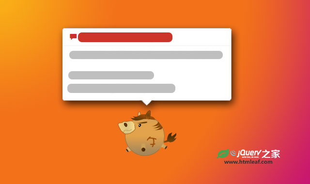
ayumi
webui-popover是一款基于Bootstrap的轻量级弹出提示框Tooltip插件。该提示框插件可以和Bootstrap完美结合,但是并不一定需要和Bootstrap一起使用。它支持IE8以上的浏览器。它的特点有:
- 运行速度快,轻量级。
- 支持多种定位方式。
- 能自动计算提示框位置。
- 在提示框中提供关闭按钮。
- 同一个页面支持多个提示框实例。
- 支持不同的样式。
- 支持使用url和iframe。
- 支持异步加载模式。
使用方法
使用这个提示框插件首先需要引入jQuery和jquery.webui-popover.js,jquery.webui-popover.css文件。
<link rel="stylesheet" href="jquery.webui-popover.css">
<script src="jquery.js"></script>
<script src="jquery.webui-popover.js"></script>
调用插件
可以使用下面的方法来调用一个提示框。
$('a').webuiPopover(options);
配置参数
下面是该提示框插件的默认配置参数:
{
    placement:'auto',//values: auto,top,right,bottom,left,top-right,top-left,bottom-right,bottom-left,auto-top,auto-right,auto-bottom,auto-left
    width:'auto',//can be set with  number
    height:'auto',//can be set with  number
    trigger:'click',//values:  click,hover,manual
    style:'',//values:'',inverse
    constrains:null, // constrains the direction when placement is  auto,  values: horizontal,vertical
    animation:null, //pop with animation,values: pop,fade (only take effect in the browser which support css3 transition)
    delay: {//show and hide delay time of the popover, works only when trigger is 'hover',the value can be number or object
        show: null,
        hide: 300
    },
    async: {
        before: function(that, xhr) {},//executed before ajax request
        success: function(that, data) {}//executed after successful ajax request
    },
    cache:true,//if cache is set to false,popover will destroy and recreate
    multi:false,//allow other popovers in page at same time
    arrow:true,//show arrow or not
    title:'',//the popover title ,if title is set to empty string,title bar will auto hide
    content:'',//content of the popover,content can be function
    closeable:false,//display close button or not
    padding:true,//content padding
    type:'html',//content type, values:'html','iframe','async'
    url:'',//if not empty ,plugin will load content by url
    backdrop:false,//if backdrop is set to true, popover will use backdrop on open
    dismissible:true // if popover can be dismissed by  outside click or escape key
}
应用举例
创建一个简单提示框:
$('a').webuiPopover({title:'Title',content:'Content'});
通过DOM元素的data-*首先来创建提示框:
<a href="#" data-title="Title" data-content="Contents..." data-placement="right"></a>
$('a').webuiPopover();
在元素的下方插件一个提示框:
$('a').webuiPopover({title:'Title',content:'Content',placement:'bottom'});
在鼠标滑过元素时弹出一个提示框:
$('a').webuiPopover({title:'Title',content:'Content',trigger:'hover'});
创建一个inverse样式的提示框:
$('a').webuiPopover({title:'Title',content:'Content',style:'inverse'});
创建一个固定宽度和高度的提示框:
$('a').webuiPopover({title:'Title',content:'Content',width:300,height:200});
创建一个带关闭按钮的提示框:
$('a').webuiPopover({title:'Title',content:'Content',closeable:true});
创建一个带动画效果的提示框:
$('a').webuiPopover({title:'Title',content:'Content',animation:'pop'});
创建一个内容使用iframe的提示框:
$('a').webuiPopover({type:'iframe',url:'https://www.baidu.com'});
通过异步模式插件一个提示框:
$('a').webuiPopover({
    type:'async',
    url:'https://api.github.com/',
    content:function(data){
        var html = '<ul>';
        for(var key in data){html+='<li>'+data[key]+'</li>';}
        html+='</ul>';
        return html;
    }
});
创建一个提示框,并通过手动方式来触发它:
//Initailize
 $('a').webuiPopover({trigger:'manual'});

...

 //Show it
 $('a').webuiPopover('show');
版权声明
文章来源: https://www.uihtm.com/jquery/8884.html
版权说明:仅限用于学习和研究目的;不得将上述内容用于商业或者非法用途,否则,一切后果请用户自负。我们非常重视版权问题,如有侵权请邮件(44784009#qq.com)与我们联系处理。敬请谅解!